
A considered identity.
Deep navy, crisp white and a restrained blue accent. Strong typography does the work, with no stock-photo distractions.
We believe a website should make its case by how it works. This one is our first showcase: designed and built by Finally Modern for Finally Modern.
A focused small-business website with one purpose: help a small-business owner understand the offer and take the next step.
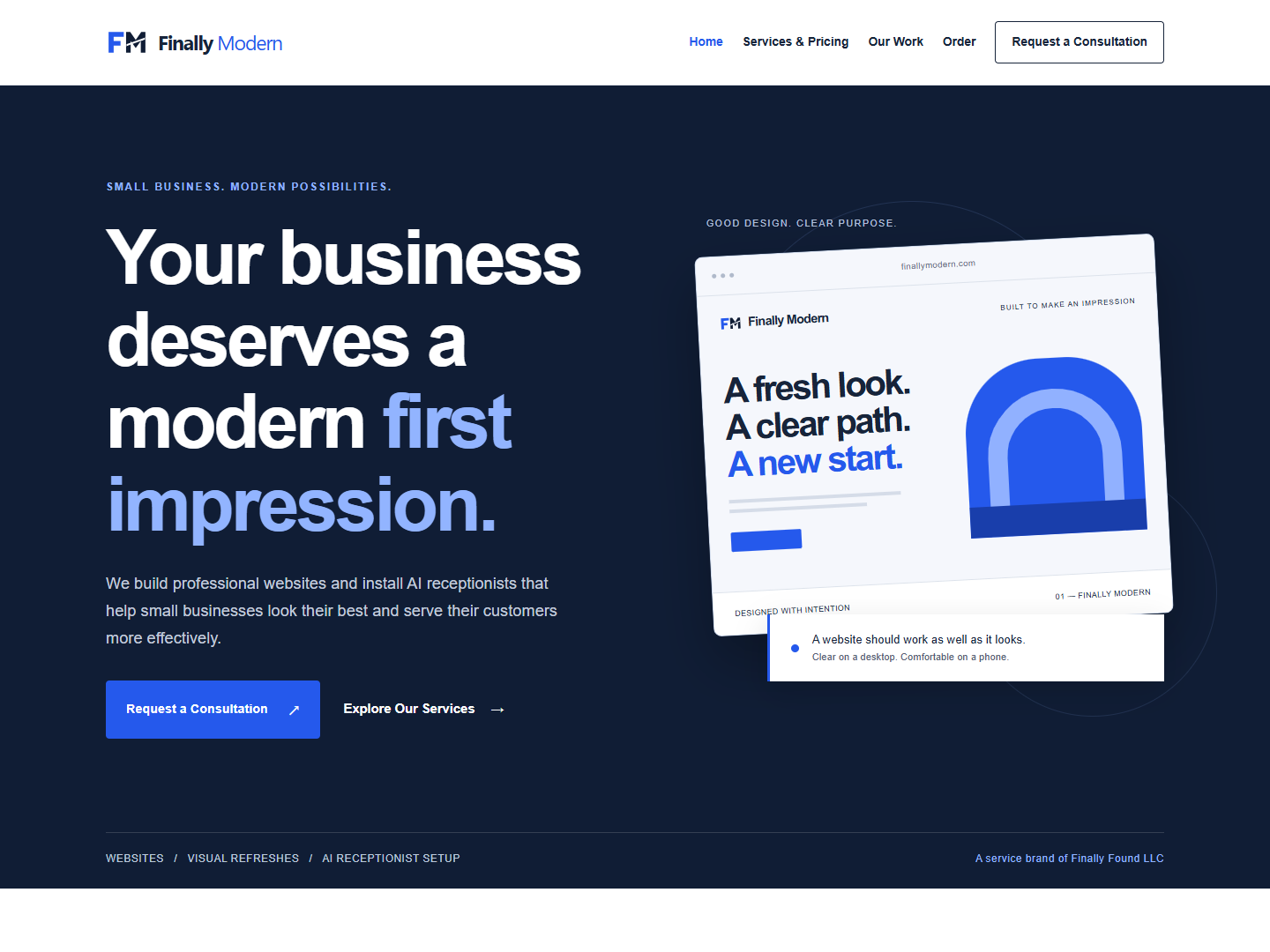
Deep navy, crisp white and a restrained blue accent. Strong typography does the work, with no stock-photo distractions.
Understand the business, compare services, inspect the work and choose a consultation or order request.
Visible service prices, a reviewed order request and an honest email-draft consultation option. No checkout, account creation or confusing submission states.
A good small-business website helps people move naturally from curiosity to understanding.
Layouts adapt from a wide desktop to a narrow phone. Navigation stays accessible, and pricing stays readable.
Consistent links, clear headings and a focused consultation page make the next step easy to find.
This is our own project, not a paying-client case study. It contains no invented testimonials, customer results or borrowed customer work.
A better website, a more helpful phone experience, or both.